Your banner’s first second matters.
Your viewer decides within one second. This is why banners lose attention — and how to prevent it with focus and animation.
 Ron van BemmelCo-owner & Creative Director · Art direction and motion
Why display banner optimisation starts in the first second.
You buy media.
You buy reach.
You buy impressions.
But there’s only one thing that decides whether a banner works:
does anyone look at it in that first second?
That second isn’t an exact measurement, but it is a good working rule. A banner usually gets no more than a quick glance, and what doesn’t land in that glance rarely lands afterwards.
This is a classic problem in display banner optimisation and an important cause of low CTR.
Eye-tracking research, including by Nielsen Norman Group (opens in a new window), has shown for years that people largely skip banners on a page: the eye looks for the content it came for. How long a banner does get looked at depends on format, placement and device, and sources such as Integral Ad Science (opens in a new window) and eMarketer (opens in a new window) each measure it in their own way. And viewability (was the banner on screen?) is not the same as attention (did anyone actually look at it?). So there is no single number for every banner. Our starting point is simple:
You don’t get time to build a banner up.
It has to land in frame one.
Preventing banner blindness takes focus, not more animation.
People see hundreds of commercial messages a day. The brain automatically filters out whatever doesn’t look immediately relevant. This phenomenon, often called “banner blindness”, isn’t a design problem but a survival mechanism.
The ad guidelines of Google (opens in a new window) and YouTube (opens in a new window) also ask for a clear message and limited animation. Our experience in practice matches that: an ad without clear focus or contrast in the first split second disappears among the rest of the page.
So a banner has to prove, in a fraction of a second:
- this is different
- this is relevant
- this deserves attention
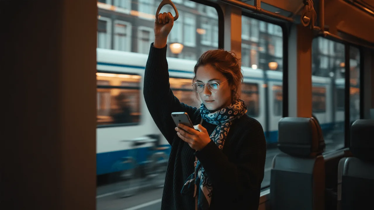
Image: made with AI, chosen by us.
The biggest mistake: an intro that thinks it’s more important than the message.
Many banners open like a mini brand film:
- Logo fade-in
- Pretty background
- Atmospheric animation
- Only then the message
That works in film. Not in display.
Frame one sets the visual hierarchy.
We use the opening frames to establish a clear visual focus.
Good start:
- 1 primary moving element
- calm surroundings
- strong colour contrast
- movement towards the message
Bad start:
- several movements at once
- no contrast
- no clear direction
- logo as the first visual focus
Logos are recognition. Not attention magnets.
Speed determines how a banner is experienced.
In UX, 0.6 seconds feels fast. In display, it feels slow.
If an animation feels right at 0.6s, make it 0.4s.
That’s 33% faster, but it often feels twice as responsive.
Display isn’t cinema. It’s attention judo.
Frame 1 optimisation in practice.
In the latest Black Friday campaign for Odido, we saw something interesting. The original banner opened with:
- logo fade-in (0.5s)
- background motion
- then product and headline
After optimisation:
- product as the first visual focus
- headline visible within 0.3s
- logo straight in, as part of the sequence
Not through more animation. But through a better-directed start.
Optimising HTML5 banner animation.
Frame 1 isn’t a design layer, it’s a timing decision.
const tl = gsap.timeline();tl.from(".product", {scale:0.8, opacity:0, duration:0.35, ease:"bb_customEase.out"})
.from(".headline", {y:20, opacity:0, duration:0.3}, "-=0.15")
.from(".cta", {opacity:0, duration:0.2});Important:
- first animation within 0.2–0.4s
- keep the stagger small
- no long fades
- frame 1 = keyframe with immediate contrast (opacity/scale)
You’re programming attention.
Why this directly affects performance.
CTR isn’t a media_metric. It’s an attention_metric.
If the first second fails:
- the message isn’t seen
- emotion doesn’t build
- the CTA is ignored
You can have perfect targeting, but without attention nothing happens.
Within 1 second, this has to happen:
0–300ms → visual focus
300–600ms → movement towards the message
600–1000ms → meaning lands
After that, people decide whether to keep looking.

Conclusion.
A banner doesn’t win with beautiful design.
A banner wins with a strong start.
Not atmosphere.
Not logo.
Not build-up.
Attention first. Then story.