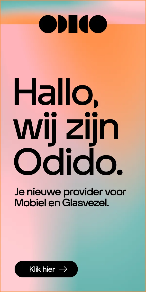
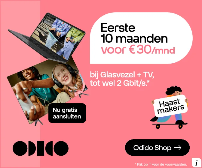
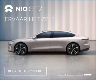
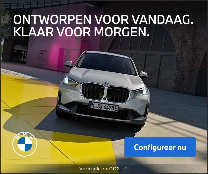
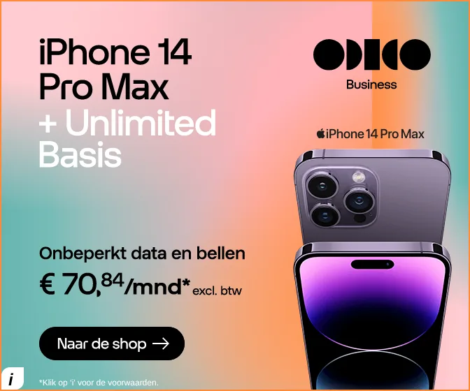
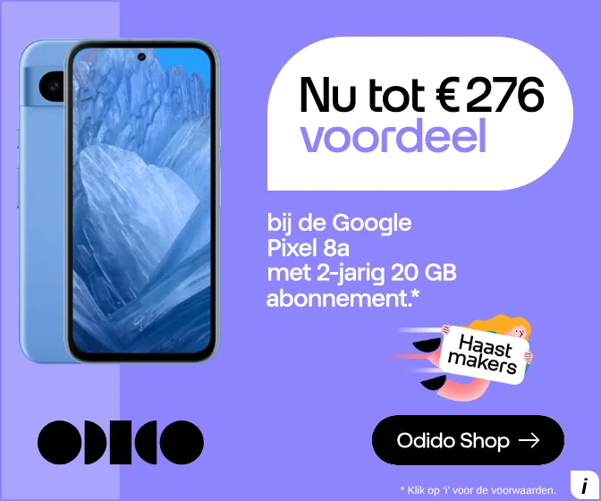
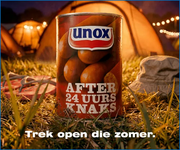
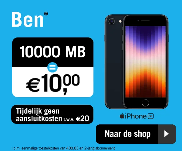
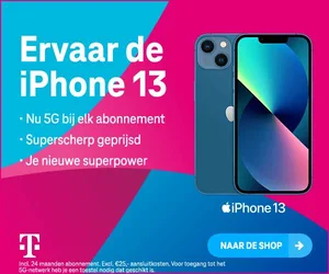
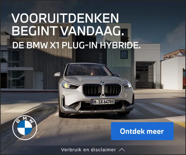
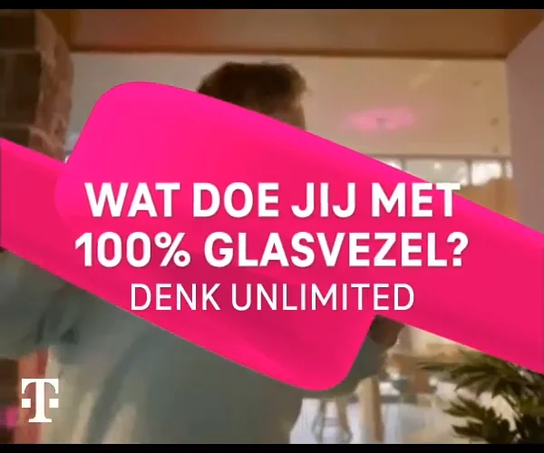
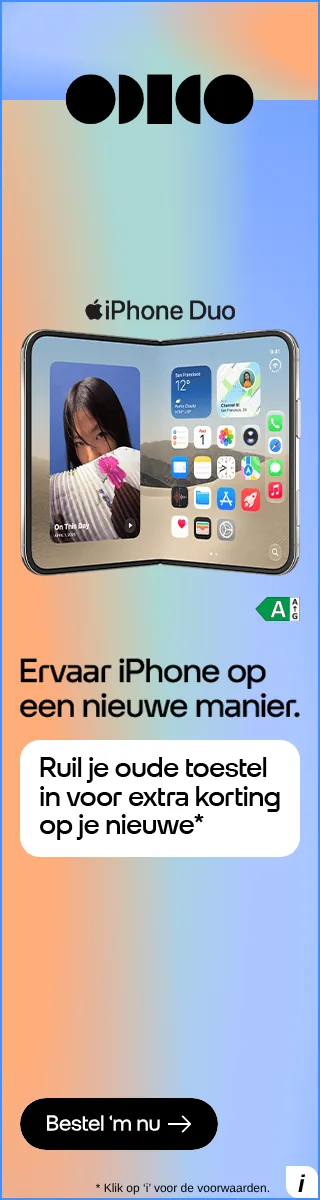
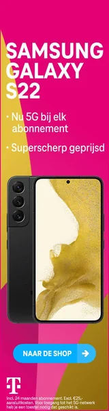
Display banner examples.
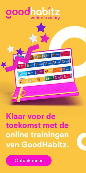
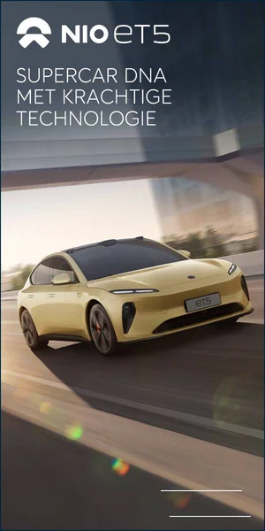
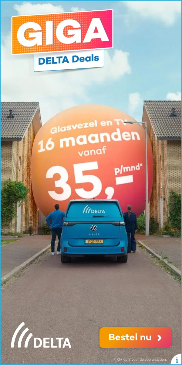
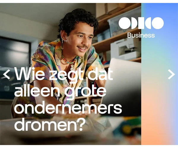
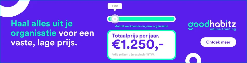
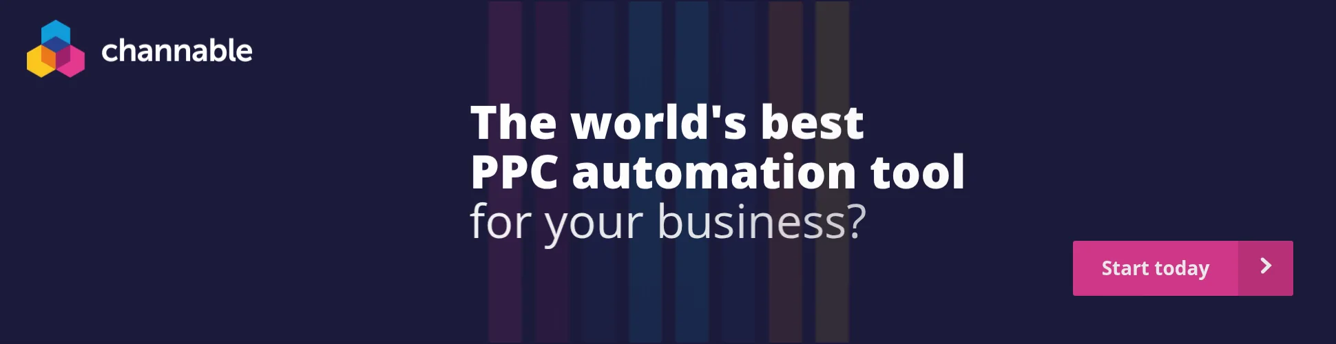
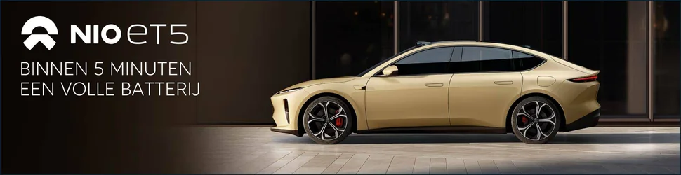
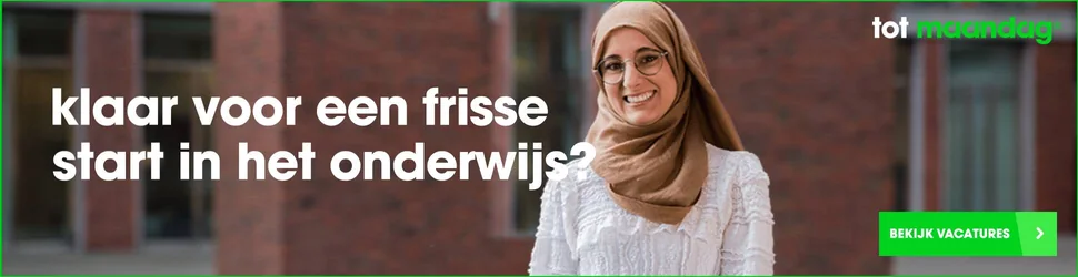
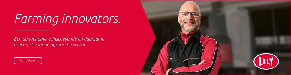
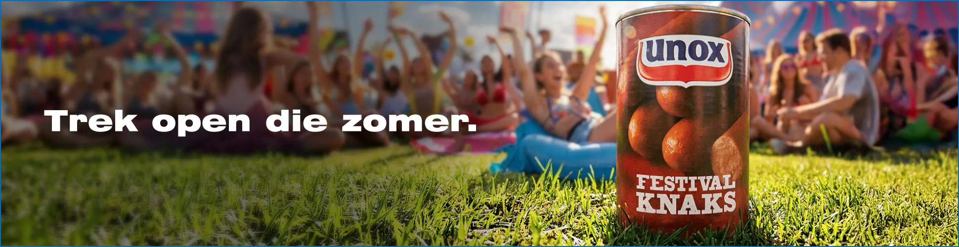
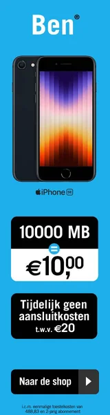
Below are nine display banners that actually ran, for NIO, T-Mobile, Tele2, Odido, ENGIE, BridgeFund and Autoabonnement.nl. At actual size: no screenshots, but the files themselves. Each group says what makes the banner work. It almost always comes down to three things: the image, the copy and the layout. Further down, more examples by format.
Image. The first thing people see.
In the first second, people decide whether to keep looking. The image does that, not the copy. One clear subject works better than five. Movement only helps if it tells you something.
Copy. Short, and one thing at a time.
Nobody reads a banner from top to bottom. It gets seen, in a fraction of a second. One headline per frame. The offer in as few words as possible. The button says what happens when you click.
Layout. Where the eye goes.
Make the most important information the largest. White space isn’t emptiness, it steers the eye. And the button sits where the eye ends up, not wherever there happened to be room.